ChiltonPRO Tablet: Auto Reference Library and Management System for iPad
I worked as a project manager and designer for the client project to prototype the ChiltonPRO iPad application, an auto reference library and customer management system that provides the complete solution for auto repair shops.
The interactive prototype is live! Feel free to play with it.
Project Scope and Challenges
For about 100 years, ChiltonPRO’s has enjoyed great success in providing state-of-art auto maintenance and repair information to its customers as it has grown into one of the most competitive content provider for automotive professionals. Nowadays automotive professionals require mobility with their tools; therefore ChiltonPRO has decided to bring their existing web-based system to a tablet device, most preferably iPad, given its unprecedented market success. In designing the iPad prototype we aimed to address to following four challenges that were particularly important to tablet devices:
- Understand users’ real needs as they move from desktop to tablet
- Reduce abundant steps and improve task flow between different sections within system (inter-section connectivity)
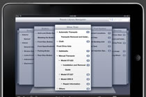
- Assist user in locating and navigating the hierarchical reference library
- Improve place-making of the comprehensive system
Research
Interviews
We as a group interviewed appropriate stakeholders, including ChiltonPRO staff, shop owners and technicians. Through those interviews we obtained a deeper understanding of the real workflow, various use cases, how ChiltonPro works, where it falls behind, and how an iPad application fits the situation.
Competitive Analysis
Our team compared 8 mobile auto repair assistant apps to better understand the strengths and weakness of similar products. The findings covered features, interface design and content, which laid a foundation of subsequent design to improve tablet version of the system.
Personas and Scenarios
Download Personas and Scenarios (441KB, PDF format)From competitive analysis and interviews we formulated a set of three personas and corresponding scenarios as the guide for our design to prevent deviation.
Design
Initial Sketches
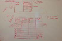
I as the project manager led my team in brainstorming the initial sketch on the whiteboard. In this phase, we came up with several new features, including Bookmarks, Repair Navigator, and Maintenance To-do List, which we believed are quite useful in manipulating tablet devices. We then converted the whiteboard sketches into wireframes using Axure RP Pro.
Use Cases
We developed and compiled Use Cases to identify and detail the interactions.
Wireframe Iterations
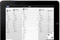
Download Wireframe Round 2 Presentation (3.1MB, PDF format)Having the use cases, project scope and design challenges in mind, I continued to lead the team in modifying the wireframes and corresponding work flows. I designed the base template, universal interactions across all sections, home screens and repair library navigator. The wireframes ultimately went through 4 major (and countless minor) revisions before being finalized as a high-fidelity blueprint for the prototype.
High-Fidelity Prototype
We moved on from Axure RP to Photoshop CS to create the pixel-level high-fidelity prototype. I as the project manager took the chair in discussion sessions to reach final consensus, provided detailed instructions on Photoshop for team members who were not familiar with the software, and designed about 30 of the 70 screens.
Interactive Prototype
Enter ChiltonPRO Tablet Demo (Please Use Safari for Best Effect)Finally, I managed the prototype design and implementation using Adobe Fireworks and the Touch Application Prototypes framework. I again hosted tutorials, designed the layout and elements for about 30 of the 100 screens used in the prototype, integrated them, and ensured the interface consistency (UI elements, typeface, layout, etc.) across all screens designed by my teammates.
Style Guide
We at last created a Style Guide document (along with a Style Guide website) that detailed how the application was to be laid out and presented in order to ensure a consistent design if the application should be implemented.
Usability Testing & Validation
The usability testing started when we were in the wireframe phase. We recruited in total 3 users to test the wireframe/prototype and provide feedback on the experience of using it: Did the application workflow match that your current workflow? Is navigation easy and convenient enough? Did the app feel more efficient than the previous website? Our application prototype was great in general, but we also gathered some constructive user feedback to improve following iterations.
Results
Hundreds of hours of interviewing and design, and finally we had the prototype delivered to ChiltonPRO team. As our client contact pointed out, our work was “amazing and exceptional” and “clearly created an optimized user experience for tablet devices”. We also provided “insight and potential possibilities of future ChiltonPRO product” that could become the “turning point”. They requested all of our design/analysis materials (only final prototype is required by the class) and intended to shift to mobile based on our prototype in the near future.
- One-Click TimeTracker UX Design & Development
- ShakeShare Product Design, UX Design & Development
- ChiltonPRO Tablet Interaction Design, Wireframing, Prototyping & Mobile App Design
- Who's That? Ubiquitous System User Research, Interaction Design, Wireframing & Prototyping
- OVIC Usability Evaluation User Research & Usability Evaluation
- Firework: Interactive Data Explorer Data Analysis, Prototyping & Information Visualization
- SocialCusp Wireframing, Prototyping, Interaction Design & Development
- PlainMed Mobile App Mobile App Design & Development
- SleepHabit Monitor Information Visualization
- Graphic Design Collection Graphic Design
- Homeshine Boutique Online Shop Project Management, Web Design & Graphic Design
- HBHE Genetics Research Website Information Architecture, Web Design & Development
- Gale Cengage Learning Contextual Inquiry Contextual Inquiry & Project Management
- UMBS Website Information Architecture, Web Design & Development


